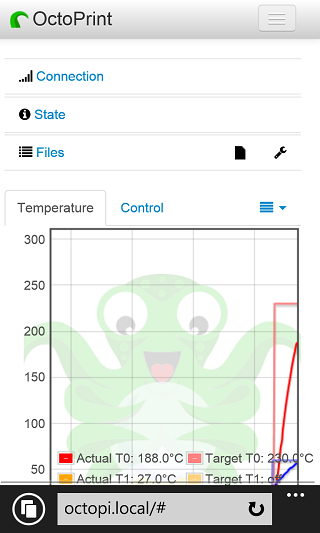
Scalable UI that does some old fashioned (v2) bootstrap responsive and some collapse etc.
Bootstrap 2 “responsive” UI, a single column on your phone
This is a little plugin that adds an HTML element here, changes some css there in a tweaky way to have the default OctoPrint UI reflow (or squish) for smaller screen sizes.
There are more epic UIs in the works elsewhere, but you can use this plugin until something better comes along.
Since it does tweak the current UI that will likely change, it disables itself on any new version of OctoPrint. My plan is to keep it up to date within a few days or even ahead of any official release until such time as it is no longer needed because of an alternate UI plugin or because bootstrap 3 happened.
Go ahead and give it a try and if you don’t like it you can always disable it or uninstall from OctoPrint’s plugin manager.
Pictures

 Plugin Repo